Few concepts enjoy as much attention in modern marketing circles as the User Experience (UX). This likely makes sense as, even without robust definitions, the term reflects an integral part of successful customer interactions. Indeed, from the starting point of one’s website, a stellar UX will enhance lead acquisition rates and conversions. In turn, a pleasant overall experience will improve customer retention rates, an extremely valuable metric. This is no easy task, however, as UX spans across the entirety of customer interactions. So, let us begin this exploration with five ways to improve user experience on your website, and you may take it from there.

An introduction to UX
First, let us introduce the concept of UX and then define how it differs from UI (User Interface). The two see notable overlaps as regards web design tools and practices, but accuracy always holds value.
Colloquially speaking, UX simply describes a user’s overall experience. This offers an actionable foundation, but deeper definitions may reveal more. For example, ISO 9241–210, formerly ISO 13407, more accurately defines UX as follows:
“A person’s perceptions and responses that result from the use or anticipated use of a product, system or service”.
The term was coined by Don Norman, co-founder of the Nielsen Norman Group, in the 1990s. His own definition of the term is somewhat similar:
“User experience encompasses all aspects of the end-user’s interaction with the company, its services, and its products.”
Subtle differences aside, such as the latter’s identification of a “company” as an element, both definitions highlight the scope of UX. As Don Norman puts it in the following video, UX is “everything”.
Thus, so far, we may distill a key takeaway; UX is not limited to website experience. It is, however, the foundation of UX web design, which facilitates overall UX.
UX versus UI
Now, many web designers and marketers will argue you will need both UX and UI design to improve user experience on your website. This argument is twofold:
- UX and UI differ, but come with interdependencies
- Both outline principles that do affect the user experience
To fully understand this argument, let us briefly distinguish the two. To do so, we may cite the Nielsen Norman Group again, through the following video:
According to them, UX design encompasses “all aspects” of interactions, including:
- Access to the right information
- Ease of use
- Efficient customer help
In contrast, UI design focuses on the technical aspects; “the look, feel, and interactivity of a digital product”. It thus constitutes “the cosmetics of the experience”, and includes:
- Typography
- Responsiveness
- Layout
Evidently, as eCommerce web design trends show, both of these principles synergize toward an impeccable user experience. Thus, our suggestions will span across both, regardless of which design school they belong to.
5 ways to improve User Experience on your website
With introductions covered, we may now delve into practical suggestions. Of course, page-level suggestions may be easier to implement than technical ones. Should you require assistance with the latter, you may consult such professionals as WP Full Care. For the former, you may look through our agency recommendations.
#1 Reduce loading times
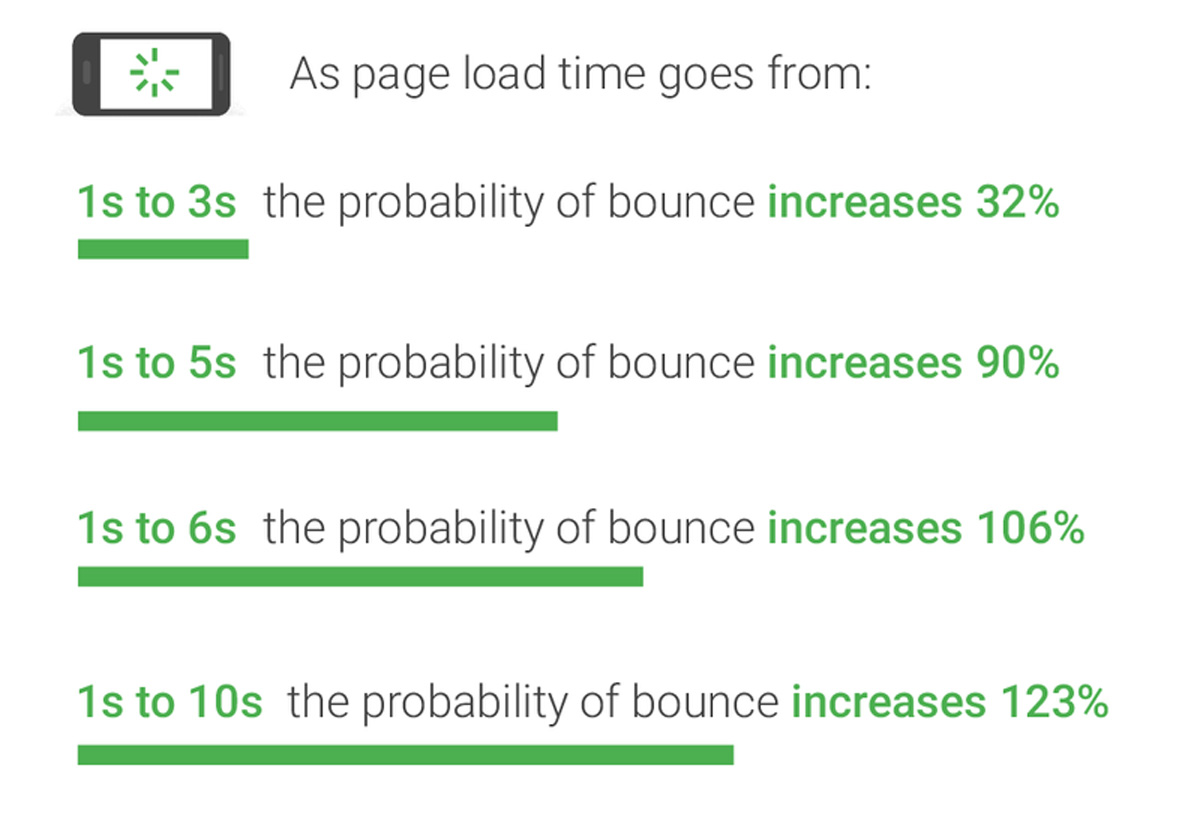
The very first contact a visitor has with your website occurs just before they reach it; as it loads. Thus, this should likely be the first UX element to scrutinize and optimize.
Modern audiences are becoming more demanding as regards their web experience, and will swiftly leave slow-loading websites. Should they bounce, you immediately lose a potential lead before they even enter your sales funnel. Indeed, Google/SOASTA research has definitively correlated slower loading times with higher bounce rates.
To reduce loading speeds and thus improve user experience on your website, you may consider such tactics as:
- Image optimizations. Maintain image file size under 100kB for optimal loading speeds, while maintaining quality. As you do, adding alt tags and keyword-rich titles will further enhance your visitors’ UX. Fortunately, the market offers many image optimization plugins and tools to assist in this regard.
- Theme and plugin cleanups. On the subject of plugins, however, heavy themes and plugins may also considerably slow down your website. To address this, you may examine any you may be using, and weigh their UX benefits against their impact on loading speed.
- Code cleanups. Similarly, unclean code may also considerably affect loading speeds. Here, you may clean up redundant or obsolete code to reduce requests and enhance user-side responsiveness.
#2 Design to Please

Past the loading stage, visitors will then process a website’s layout and overall visual identity. This first impression can decidedly inform a visitor’s opinion, in turn impacting UX – even though this element belongs more firmly in UI.
The overlap between the two, as we discussed above, may best be illustrated by what UserTesting dubs the “aesthetic-usability effect.” In their own words,
“[visitors] assume that if the website is appealing, the product and service will also work properly[. If] it looks good, it must be good.”
Citing NNG themselves, they use their Fitbit case study to illustrate this point. Namely, that visitors overlooked technical shortcomings because of their positive predispositions fueled by aesthetics.
The phenomenon notwithstanding, designing a website to visually please should account for both visuals and function. Namely:
- Information above the fold. As visitors primarily focus above the fold, this is where crucial information should be placed. This may include contact information, slogans, and circumstantially valuable buttons.
- Readability. Next, visitors should be able to immediately absorb all relevant information a page offers. This vast design principle entails liberal use of white space, color balance, font choices, proper content formatting, and any other elements that affect a page’s readability.
- A clear course. Finally, in line with the above definitions, UX heavily relies on a user’s expected interaction value. To address this, you may examine each page’s proposition, and ensure visitors know exactly which courses of action they offer.
#3 Research and Optimize your Content
Past the aesthetics and on to tangible interaction value, content optimizations are among the most substantive ways to improve user experience on your website. This is the principle SEO dubs “user search intent match”, which gauges how well content matches the user’s intended outcome.
This stage is also twofold, as it requires
- Audience research for content optimization
- A careful delivery of content along the customer journey.
To address this deep, complex phase, you may start with the fundamentals:
- Research your audience. Consider audience analytics tools, CRM software, and any other assets toward acquiring user and customer insights. With them in hand, segment your audiences based on demographics, psychographics, and other relevant subsets to fuel buyer personas. It is this foundation that will enable customer journey mapping.
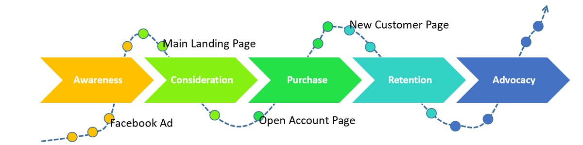
- Craft content for each journey phase. Next, consider each distinct journey phase, and craft content devoted to it. Both copy-wise and design-wise, each page type should specifically serve its intended phase, from informational landing pages for awareness and consideration to alluring product pages for conversions.
- Design around your intended journeys. Finally, design should account for each journey phase, and each customer journey. Here, consider the difference between an informational and a transactional page’s call to action (CTA) as a notable example. While all pages should exhibit universal qualities such as readability, your analytics should inform phase-based customizations.
#4 Solidify Your Content Structure

On the subject of customer journeys, content structure plays a pivotal role as regards both UX and final conversions. The reason for this is simple; a logical, hierarchical content structure offers much higher usability and much more fluid navigation.
This principle concerns both website architecture and internal link choices, of course. The latter will heavily rely on the steps above, as we’ll cover next. As regards the former, Adobe identifies two main architecture approaches for designers; top-down and bottom-up.
To solidify content structure, you may begin with the following practices:
- Establish a solid content hierarchy. The fundamental bedrock of content structure, a logical hierarchy, will massively improve user experience on your website. Consider your website’s goals and needs, consult your analytics, and opt for a logical architecture following Adobe’s aforementioned guidelines.
- Provide sitemaps and breadcrumbs. User-side, sitemaps and breadcrumbs can excellently leverage a robust content structure. The former will allow visitors to immediately find relevant information and content, directly improving their experience. The latter will allow them to know where they are within your website, further enhancing its usability and value.
- Strategically link to relevant content. Finally, internal links are a very lucrative practice toward both offering more contextual value and subtly reinforcing journey paths. However, a crucial element lies in relevance; a misplaced link may distract visitors from your intended outcome. Thus, carefully consider which phase-specific pages link to which other pages, internal or external, and consult your analytics to decipher their exact effect on UX.
#5 Optimize Your Calls to Action
Finally, CTAs and CTA placement are the cornerstones of Conversion Rate Optimization (CRO). At the same time, they address a key phase of the customer journey with direct UX implications; conversions. This equally intricate marketing subject does not simply offer to improve user experience on your website. Indeed, being integral to CRO, it directly impacts final revenue.
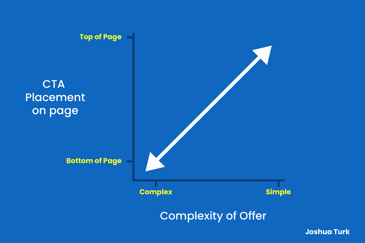
For an initial example of its depth, consider the correlation between offer complexity and on-page CTA placement, as Joshua Turk finds. His research holds that simpler offers should reside at the top of pages, while more complex ones should take their place closer to the bottom.
To optimize your CTAs toward enhancing UX, consider the following:
- CTA placement. In line with the above, consider where your CTAs should be placed. Simpler CTAs, such as ones for free resources, may deserve a much higher spot than more complex transactional ones. Similarly, consider on-page placement in itself; no adjacent visual elements should obscure them or distract visitors from them.
- CTA clarity. A crucial aspect of UX, you may examine CTA clarity. This includes readability, through optimal colors, fonts, and shapes; clarity, through copy; visibility, through optimal placement. CTAs should, at all times, offer clear value and understandable propositions for optimal effectiveness.
- CTA quantity. Finally, consulting your analytics, you may consider CTA quantity on a page-by-page basis. Typically, offering more than one CTA introduces the risk of option fatigue, both reducing conversion probability and displeasing the visitor. However, your analytics might suggest you can use more for individual pages, depending on your visitors’ behavior patterns.
Conclusion
To summarize, there are ample ways to improve user experience on your website. You may start with reducing loading speeds to reduce bounce rates and enhance lead acquisition rates. Then, you may carefully consider the aesthetics of your website and pages, reconciling the visual with the functional. Having ensured both, you may delve deeper, crafting content that caters to visitors’ needs and interests across their journey. Finally, you may deliver said content through solid website architecture and pristine CTAs, benefitting both their UX and your website’s conversion rates. While only rudimentary, this exploration of the matter should hopefully inform your decisions and help your website thrive.
Leave a Reply